Official Website of Liam Houghton
Wednesday 22nd January 2025

"In most people's vocabularies, design means veneer; it means interior decorating... but to me, nothing could be further from the meaning of design. Design is the fundamental soul of a man-made creation that ends up expressing itself in successive outer layers of the product or service."

These words came not from a designer, but from the late Steve Jobs; an engineer and businessman. He once admitted that he only grasped the importance of good design having undertaken a typography class almost by accident. That accident went some way to changing the world. It challenged the engineers of modern technology to react to the often irrational, emotive world of the average user for the first time, leaving the strictly logical and inflexible interfaces to the engineers themselves.

Jobs was absolutely correct in identifying that design is the "soul of man-made creation" expressing itself, and, it is because of this, that successful design is rarely done by committee. For Apple, it took Jobs to recognise its importance, but one British man to realise the vision; Jonathan Ive.

As American designer Thomas Vasquez once said; "Compelling design occurs not by employing the principals of a democracy." It is, indeed, much more like a monarchy. A designer almost always grows up surrounded by design, and it is this irreplaceable preparation - an innate rapport with what others experience - that guides them in everything they do.

Warwick School for Boys2001 - 2008
Granted Scholarship for Academic Excellence

Warwick School
GCSE Art & Design:A*
Completed courses in stone carving, drawing, painting, and etching in acid.

A Level Art & Design:A
Awarded 100% at A2 level. Did not drop a single mark in modules on theory, painting, graphics or photography.
  • LONDON 2012
    Concepts and ideas mocked up for events in and around the 2012 Olympic Games in London.
    22 September 2011 • 27 images
  • ART & DESIGN
    Various graphics, paintings and drawings from the archive. Includes art exhibitions and theme park ideas.
    12 September 2011 • 48 images
  • BRANDS & PUBLICATIONS
    Some examples of original logos, brands, websites, and other publications on which Liam has worked.
    16 September 2011 • 54 images

Liam has been immersed in a world of design all his life; his mother was in the interior and product design industry, and he acquired a reputation, even at primary school, for being "the arty one," and this continued through to university.

Philosophy

Despite this, he continued to develop other interests in parallel, particularly in the sciences, philosophy, and later in business too. You can see this progression and union of interests in some of the art work in his portfolio.

One painting is made up of tens of thousands of words, painstakingly handwritten onto a 2m board; the words, that of an essay discussing if we are really in charge of our own destinies or if the future is largely predetermined by events out of our hands.

Possibilities

In another piece, a spiral of copper represents a timeline with events - both past and predictions of the future – hanging from it. At one end hangs a large sphere of metal symbolising the solid and unchangeable nature of our past, and at the other, another huge sphere, but this time a hollow one formed from a web of string – each string a different timeline of possibilities that are untraceable in their consequences – a representation of the future.

ART & DESIGN

Design surrounding the Olympic Games has a fascinating history; from the first Olympic Torch designed in Nazi Germany, to the Olympic rings themselves – first adopted in 1914 – and to the controversial architectures of the Montreal stadium and the entire Beijing games.

Head-hunted

In January 2011, Liam was head-hunted by the design team at London2012 for a senior position in creating the 'look of the games', having seen his Olympic concepts posted on this very website.

Unfortunately, this offer could not come to fruition as I had yet to complete my architecture degree; something which I had already put a huge amount of work into. Some of my concepts, though, may still yet be implemented. If a set of Olympic rings go up on the London Eye or The Shard at London Bridge, then you now know where the inspiration came from!

Design Classic

I have been interested in the Olympic movement for a long time and particularly in the successes – and failures – of each host city in terms of design. Otl Aicher's graphic designs for Munich 1972 have gone down as nothing short of design classics. Something similar can be said of Lance Wyman's designs for Mexico 1968 too. It is interesting that whilst that period is now seen as a troubling time for architecture, in terms of graphic design is it perhaps a modern golden age. I suppose it's not actually that surprising either, given that modernist architecture is extremely graphical in form itself. It's just unfortunate that humans don't particularly enjoy living inside a graphical environment.

I had been following and supporting London's bid for the 2012 games since it was first speculated about in 2002. Long before the media picked up on the possibilities, I had been wondering of what an Olympic Games in my own capital could bring. I remember being the only one in school who knew of the bid result as it was announced live from Singapore as I secretly listened to it on a crackly radio during a lesson about the Russian revolution.

Controversy

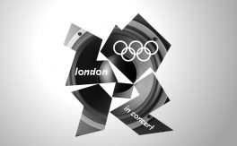
London 2012's design set has since emerged as being one of the most controversial in Olympic history. Its emblem and brand radically departs from the tired, human-form abstractions of the past, and opted instead for a striking graphic that represents not much more than energy or dynamism. Although many did, and still do hate it; I liked it then, and I love it now. I believe the core of that brand will eventually be seen as a design classic akin to that of Munich. It was way ahead of its time, and for good reason seen as it has to last for 5 years and still be seen as fresh and new by the time of the games themselves.

London, unlike virtually all its predecessors, needs no introduction on the world stage, and so the task is to modernise the image of quaint Britain. The brand's sheer versatility is its greatest selling point. It can be adapted to any colour, or even be formed from an image or outline as I've demonstrated myself. This inbuilt flexibility means that it is a brand that's great fun to work with, and so a few years ago I experimented with it myself, thus creating the concepts which you can view in my portfolio.

BRANDS & PUBLICATIONS
ART & DESIGN
ART & DESIGN
LONDON 2012
LONDON 2012
LONDON 2012
LONDON 2012
LONDON 2012